01 · EXPLORE COLOR APPEARANCEColor Temperature Explorer
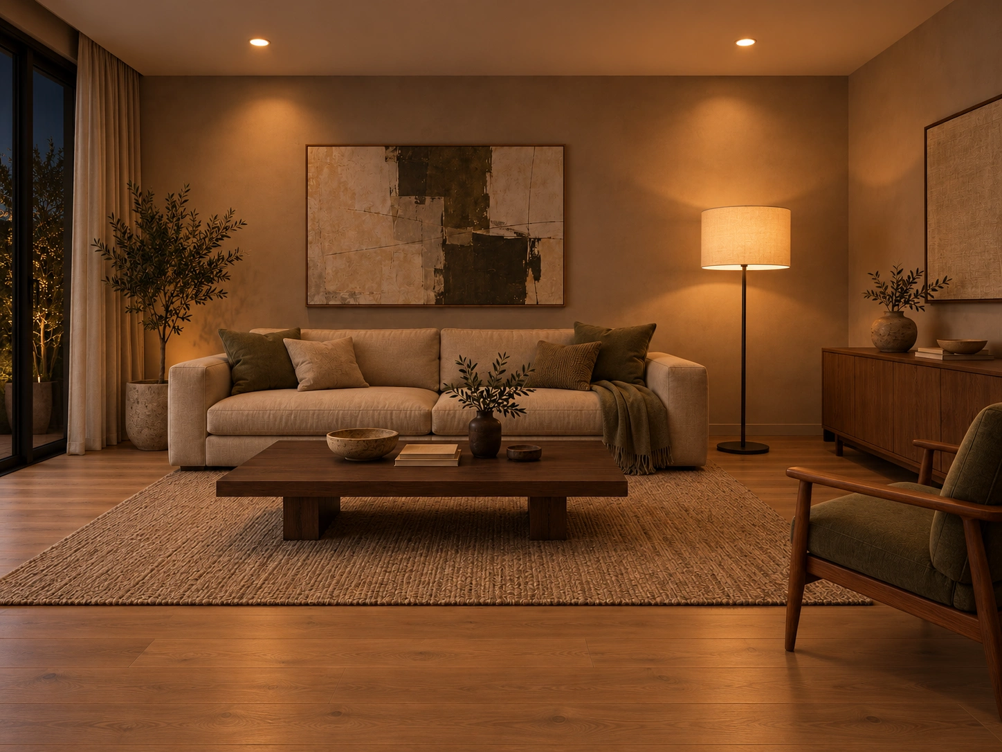
Compare the same kind of room under five white-light appearances. Colour temperature can shape a room’s mood impression: warm whites are often read as intimate or restful, neutral whites as balanced, and cooler whites as crisp or task-focused. These are tendencies, not guaranteed effects of Kelvin alone; brightness, spectrum and colour rendering, contrast, finishes, time of day and personal response also matter.
Treat CCT first as an atmosphere and materials decision. Compare the actual fixture against the room finishes. CCT alone does not describe colour rendering, brightness, glare, flicker or the source spectrum.
Illustrative preview only. Local fixture and reflected-light effects show relative warm-to-cool character; this is not a photometric or spectral simulation.